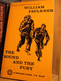
 My Faulkner paperbacks tend to feature unsavoury cover images.
The editions that slap a nice harmless photograph of the author on the cover strike me as the most successful covers, aesthetically. Faulkner looks good and literary, with his sweater-and-suit outfits, his pipes, his dashing hair and moustaches. The off-putting Faulkner covers arise when designers attempt to illustrate the concepts or themes strongly associated with his work--the stagnant South, family secrets, racial tensions, fraught inheritances, etc. These are all excellent and worthy concepts, but "Southern Gothic" isn't something easily illustrated without being laughable. I own five Faulkner novels, and my editions of his books have uniformly bad covers. Faulkner's books seem to pose a particularly difficult challenge to book cover designers, however. Not many current editions of his books have covers that'll knock your socks off; many of Vintage's more recent trade paperback covers aren't much better than the ones on my crappy old mass-market paperbacks. In fact,the newer book cover for Sanctuary bites its concept from the 1970s-era Light in August pictured here.


The current Vintage cover series seems to have opted to illustrate the environmental Southernness of the books. These covers display window panes with condensation, massing storm clouds and lush Southern greenery, usually in a bruised yellow / purple colour palette that could be an indirect indication about the "sicknesses" that emerge in those settings. Someone clearly put some thought into how to indicate the books' contents while also developing visual themes usable on all of the Faulkner books, regardless of the indivual text's content. As a result, on the one hand, the storm cloud cover for The Sound and the Fury seems to indicate that the designers asked themselves "What is the easiest way to illustrate that title?" and called it a day. On the other hand, the cover for Go Down, Moses is appealing and historically specific in ways that work much better than some of the vague, "atmospherically" Southern imagery. (After a quick search, I found that Eudora Welty took that photo, I'm guessing during her stint with the WPA, which means that the photo probably shows a scene more or less contemporaneous with Faulkner's writing).
My books' covers, pictured above, are for editions issued over a range of decades (as far as I can tell--the dating is imprecise in some of the older mass market paperbacks). The Sound and the Fury cover is from the 1950s, the Sartoris from the 1960s, the Light in August from the 1970s, and the As I Lay Dying from the 1980s. Only the Sartoris is a non-Vintage edition. The problem with most of these is not so much the design concepts, but the bad art plugged into those designs. The cover concept for Sartoris is fine, but the smudgy execution is not so hot. As I Lay Dying is cartoony and lurid, which isn't exactly incompatible with Faulkner's literary aesthetics, I guess, but it doesn't make me want to read the story that image illustrates. The Sound and the Fury cover makes more sense after you've read the book. However, at first glance, I thought it illustrated mis-matched convicts escaped from prison and fleeing the law while still shackled together. The cover colour is also awful. My Light in August has an okay cover that is actually more clever than I realized at first glance--it's the old condensation-on-the-window-pane image, but shot at an angle that makes the blind pull also suggestive of the gallows. However, the image in and of itself is kind of boring.
Nonetheless, it's better than this:  I really don't understand what sold this cover aesthetic to the people at Vintage.
 I really don't understand what sold this cover aesthetic to the people at Vintage.
A tangential point: when it comes to Southern Gothic, I prefer Flannery O'Connor to Faulkner. I don't see her books as often, though, so I don't have the impression that her covers are doing a disservice to her books. Nonetheless, given her eschatological / Catholic apocalypticism, I'd expect more Christian-style iconography on her books; however, beyond the occasional patterned cross, the more dominant imagery for her book covers tends to be bird imagery (birds and peacock feathers). That more specific unifying imagery seems better than the rather generic imagery of "the South" used on the covers of Faulkner's books.


i burst out laughing when i saw that last cover there. Hi-la-rious
ReplyDelete